The baseline is a calculated snapshot of how your content performed within a given period in time and provides the anchor for your metrics. It anchors what is considered “normal engagement” for your publication, which in turn informs the engagement score, telling you if a story is performing above or below a normal engagement level.
In this article, we will discuss:
How is the baseline calculated?
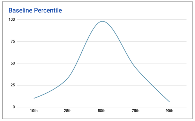
The baseline is calculated using percentiles. A percentile shows which part of the curve an engagement score falls at, and how many engagement scores are represented, allowing for a sophisticated and nuanced indicator of story performance. It is more informative than using an average because a percentile mitigates the effect of outlier values (i.e., extreme high or low values) in the full metric dataset that can influence the score disproportionately.
How is the baseline used?
The baseline anchors your data by setting the bar for what is considered “normal engagement” for your publication.
In Metrics for News, the baseline informs the engagement score, the green, yellow, and red scores each story receives to let you know, at a glance, if your story is performing above, at, or below a normal engagement level.
Where do I set the baseline?
Before you set or update the baseline, please note:
-
Only admin-level users can access and manage the baseline settings.
-
Typically, the baseline is set once at the initial app setup stage and then annually updated by an account admin. See more below regarding considerations when setting the baseline.
-
Notify the Metrics for News users in your organization that the baseline will be changing because the engagement scores will change as well.
Now, go to Metrics for News.
-
Go to “Settings”
-
Under “Engagement”, click “Engagement Scores”
-
Under “Manage baseline data for Engagement Scores”, click “View or Edit Your Baseline Data”.
-
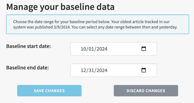
Go to the “Manage Your Baseline Data” section.
-
Use the calendar picker to select a baseline start date.
-
Use the calendar picker to select a baseline end date.
-
Click Save Changes.
What should I consider when setting or updating the baseline?
We recommend:
-
Setting a timeframe of about three (3) to six (6) months long. This length of time will provide a statistically more accurate percentile calculation.
-
With that said, there are many instances where you might want to go outside of that suggested range in any direction. For example, you might have had significant changes to your website or analytics source that require a shorter baseline. Or you might be running an experiment and want to have a longer baseline.
-
-
Consider your newsroom and/or organizational goals. How will the engagement score help inform your business and editorial strategies?
-
Ensuring MFN has content and analytics imported already for the timeframe you are selecting.
-
For partners who are in the onboarding phase, set the baseline after your initial app setup is complete and learning mode has processed.
-
-
Deciding on a timeframe that most accurately reflects what you think is normal engagement for your publication. For example, you might want to exclude outliers such as election periods (unless that is considered normal), or a significant unexpected down period (e.g., CMS or website outage).
-
Choosing a timeframe in the most recent full calendar year (e.g., if today is February 2025, select a time frame within 2024).
-
Updating your baseline annually to ensure it reflects the most up-to-date metrics.
-
Think about your newsroom’s habits using MFN. Does your team use MFN daily? Is there a busy time of day? Consider the timing of when you change the baseline setting so that it minimizes impact of what your users see.
-
Notifying your newsroom before modifying the baseline settings, as the changes will be reflected in the engagement scores they see.
-
Using your annual baseline update as an opportunity to re-educate your users on strategic uses of Metrics for News in their daily content analysis. Send a quick note explaining what’s happening, why it is happening, and how an updated baseline will benefit their analysis.
Why should I update the baseline annually?
-
Keeps your engagement scores fresh, therefore keeping your analysis current.
-
Doesn’t keep you too tethered to the past.
How do I interpret the percentile tables?
You can see the breakdown of a baseline metric and where it falls on the percentile range on the baseline settings page. View the baseline data by selecting from the dropdown menu under “Current baseline”.
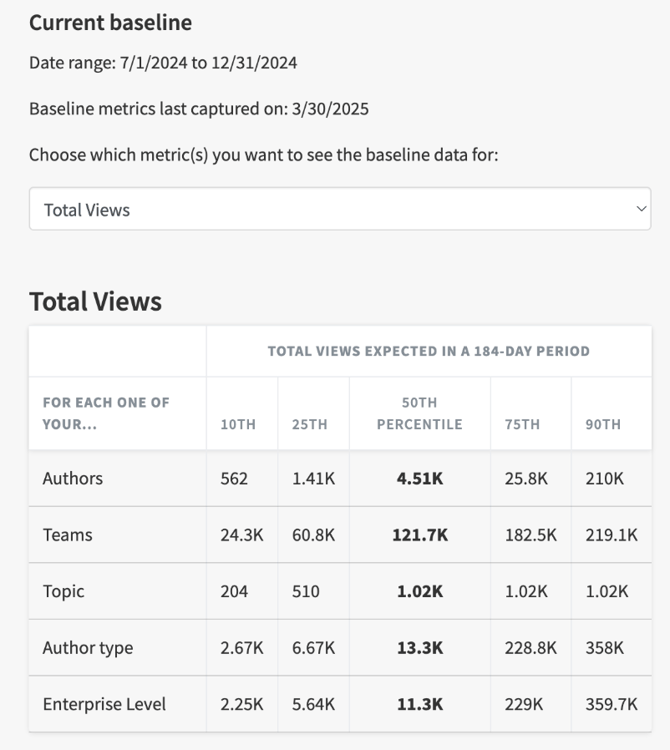
In the example above, the chart breaks down the baseline metrics for the “Total Views” metric.
Looking at the Authors row, the 50th percentile (or median) for Total Views is 4,510 total views amongst all of the Authors. That means 50% of stories have more total views and 50% have fewer total views.
If a story has around 500 total views, then it falls in the 10th percentile amongst all of the Authors (i.e., 90% of stories have had higher engagement) and its engagement score would be red because it is below the median. If a story has around 210,000 total views, then it falls in the 90th percentile (i.e., 90% of stories have had lower engagement), its engagement score would be green because it is above the median.
Remember the bell curve of a percentile range when viewing these baseline metrics and your content.